Artist Book -Design Development & Construction

Sticking with the idea of using quick, low fi or haptic ways of recording objects such as sketches or processing images through phone editing apps like snapchat I began exploring other ways of building a quick archive of images.

My favourite and definitely the most interesting process through this project was moving an image around on the flatbed of a photocopier to create alternate iterations of the same piece, then collaging or drawing over it before printing yet another version of the same original piece over the top. The results were varied and sometimes difficult to control Making it a really interesting process to work with.

DD499E5B-6C10-49A0-AA8E-1ADBA1DC35AFCAA1E31D-926C-4211-AA5E-54706A2CDE47

F58CBCA8-180E-49D8-B1F0-496E57E0484D7B222EB5-E687-46C5-8C3C-7D6FA5DAD6F3A2EACF8E-DCB2-4852-9E10-61BF0090CFDE99832802-4A35-48C4-8F89-CBF30CAB111B30CA1EE1-2445-4E35-BB51-51799159477E06E9FDA6-087E-48D8-A300-E2727EF77CAB

I used different types of papers and materials such as acetate to make the final prints that I used in the construction of my book. I organised the pages in a way that translates the theme of gradual distortion and destruction by putting pages with cleaner, more recognisable images and motifs at the front and the really distorted, unrecognisable pages at the back.

To increase the durability of the book and to make looking through it a more pleasant tactile experience I covered each page in clear plastic book covering and bound it using metal clips.

Artist Book – Idea Generation

DCB98D19-DB55-48CF-94E2-0A98B2238BAB

Repetition 

Repeat

Mass

Multiple

Consistent

Inconsistency

Iterations 

Gradual change


Amulet

Ornament

Protection

Worn

Displayed

Historic

Lucky

Charm

90773BE3-4198-4574-9EF0-C8AB3DB44DF06B1C6D98-613A-472F-BF2E-48FF2DD65F78

Forced limitations – archive of visuals created using only my initial sketches and references, manipulated with haptic/low fi/fast processes only.

3D shapes in Photoshop & Illustrator

7F619E7D-FFAE-45F5-B5C7-1DF48A54E53502831B1D-1F70-4A9F-80B4-A762E0A3B859

Two posters I produced while relearning how to create 3D shapes in Photoshop and Illustrator. Below is an outline of the steps involved in the process that I can use for reference in the future.

CBA34B98-592B-48D9-AF10-964F16CA4B2BFC63A862-FBE4-4A12-B789-8A7BC292EC9B 74DB766D-7A03-4781-A45B-326D1F6734C4

Purity Brewing Co. – Idea Generation

The Purity Brewing Company is a name synonymous with music and the arts with its ‘finger on the cultural pulse’.

Discerning when it comes to culture.

‘Pure Quality, Pure Eco, Pure Ingredients’

8E9E987D-A46C-454B-8786-254A7B701D41

I began my idea generation process with the creation of mind maps expanding on the words quality, eco and ingredients. The concepts I was most interested in expanding on were related to the earth, the seasons and the idea of story telling or narrative – from these I created some quick initial sketches.

 To further my ideas I utilised word association and found the idea of unnatural or fictional landscapes interesting, as this also could relate back to the layered fields that the craft beer is brewed in.

0A899C87-322A-4121-B705-D1190E469B96

From this starting point I played around with some techniques I’m familiar with in Photoshop and produced the following images.

3691885A-FD43-4581-A70E-BA4DD9FF9DC8

Brutalist – Glossary of Terms


A5F56984-5ABF-450B-847F-3C14DCF5EA4EED3B0613-8C6A-472D-BB50-FDB12B258F30

Brutalist architecture descended from the modernist architectural movement of the early 20th century and flourished between the years of 1951 to 1975. Brutalist designs are dictated by function over form with mundane functions and raw construction left exposed.

The architectural style of Brutalism has divided opinion for decades with many dismissing brutalist buildings as ‘monstrosities’.

The Boston City Hall, as an example, was subject to frequent disapproval and cries to tear it down despite continually making the ‘best of’ architecture lists.

‘Brutalist architects developed a style that didn’t care for comfort or easy-on-the eye aesthetics – instead these buildings are stark and minimalist, and perhaps more importantly – you can see exactly what materials they’re made from and often the inner workings are exposed. Their ‘confrontational’ appearance is a byproduct of these materials and their form.’ – userzoom.com

5BC6FC4E-D592-4B4D-B545-6F80E4C2CE82

F9A2C46C-2E71-40BE-A46E-4737AAF76F2C

8E3ED441-8F9E-4756-B8DA-DB18509E175B

The return of Brutalism in design is reminiscent of the early days of the web, where websites were brutal because they had to be.

Brutalism in graphic design is not a subtle design technique. Characteristics of brutalist design can include elements like stark backgrounds, crowded design, overlapping elements and a lack of symmetry or spacing – again, often dictated by functionality over form.

D3E758AB-3394-4487-9458-6367866751FE

3 Curated Online Spaces

3D9F3B94-925C-48F2-B9E4-B1535FBF3471

E563156F-1A5B-4421-B295-716BB14D32D4

C19AAD3B-6C09-4FC8-9137-04CCAD8758DB

First is my curated space with the most simple concept. The theme running through every image in this board is the colour aqua.

Visit the Pinterest board HERE

CFB187A2-568C-4F34-A475-5B0A03113F44

56B409F5-2ACA-4799-8244-1E1AE1A9B421

BCB1435D-D8F2-4DA7-9241-92A5D43EE156

The collection ‘Human’ is a curation of images that allude to the human form or the presence of a person, although a living human form is never actually present in any of the images.

Visit the Pinterest Board HERE

8758A2DD-F199-4385-83F5-EF8AB3066E16

Through my final curated space I wanted to produce a more interesting concept. I sourced scenes and trailers from a variety of films from cult classics to Disney to youtube ads and took screenshots whenever the word ‘and’ was spoken.

Visit the Instagram profile HERE

Presence and Absence, Ice and Water

UAL Level 3 Extended Diploma in Art and Design Final Major Project, Merit grade.

IMG_0618

FullSizeRender-3


IMG_0572

IMG_0616

IMG_0628

IMG_0568

IMG_0583

FullSizeRender-2

IMG_7092

Project Evaluation

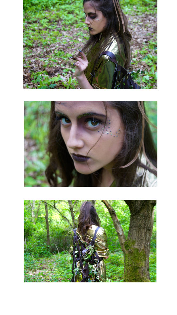
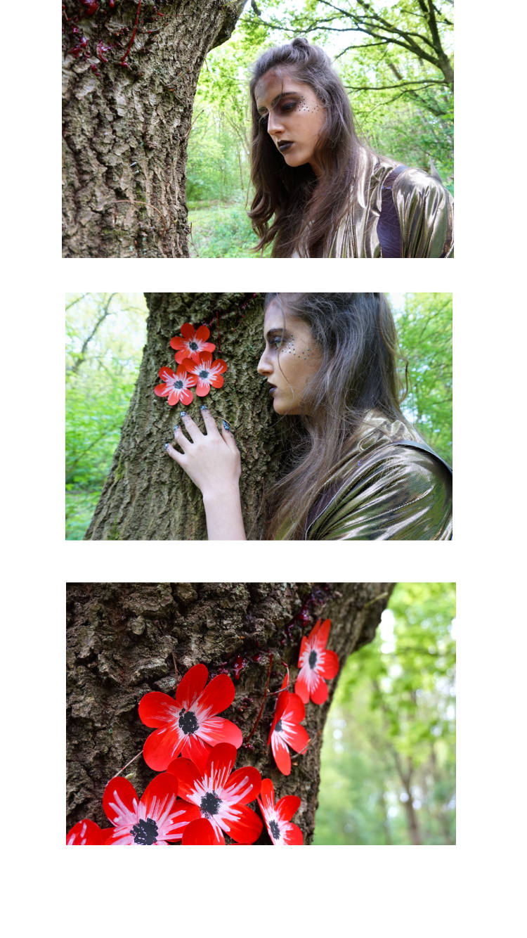
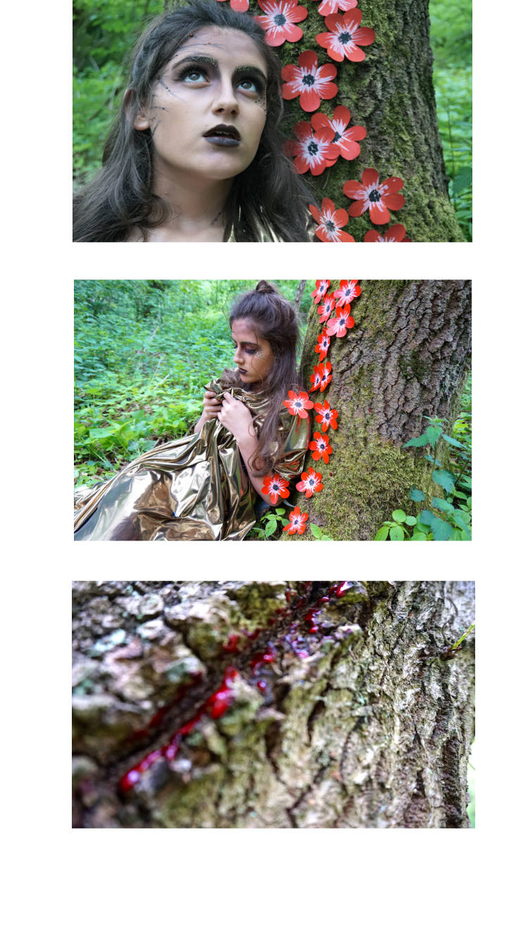
Through this project I set out to communicate the rapid detrimental change of vital areas of the earth through a collection of garments made from upcycled fabrics. I gave myself the theoretical brief of working as a junior designer for Faustine Steinmetz in collaboration with the UK Youth Climate Coalition, an environmental group run entirely by young volunteers. As the collection was to be featured in Dazed and Confused Magazine, my intended audience would largely be made up of young readers interested in fashion and youth culture who are perhaps unaware of the environmental damage human life is inflicting on the planet. To make a harder impact I also explored themes like drowning and human death in the worlds waters – my theory being that readers heads are more likely to be turned when faced with the prospect of human danger.

I think I met the project requirements well. To keep track, reach targets and plan for how I wanted my project to develop I wrote frequently in my research journal outlining what tasks I needed to complete, how I would do it then when a task was complete I would critically reflect on what I liked, what I could improve and what I needed to do next. This method of planning was effective because it forced me to think deeper about what I was doing and how all my work connected and made sense as a whole. To improve my time management I should have been harder on myself to complete tasks within a set time limit, this would have saved some stress towards the end of the project.

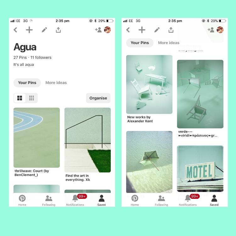
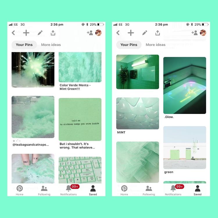
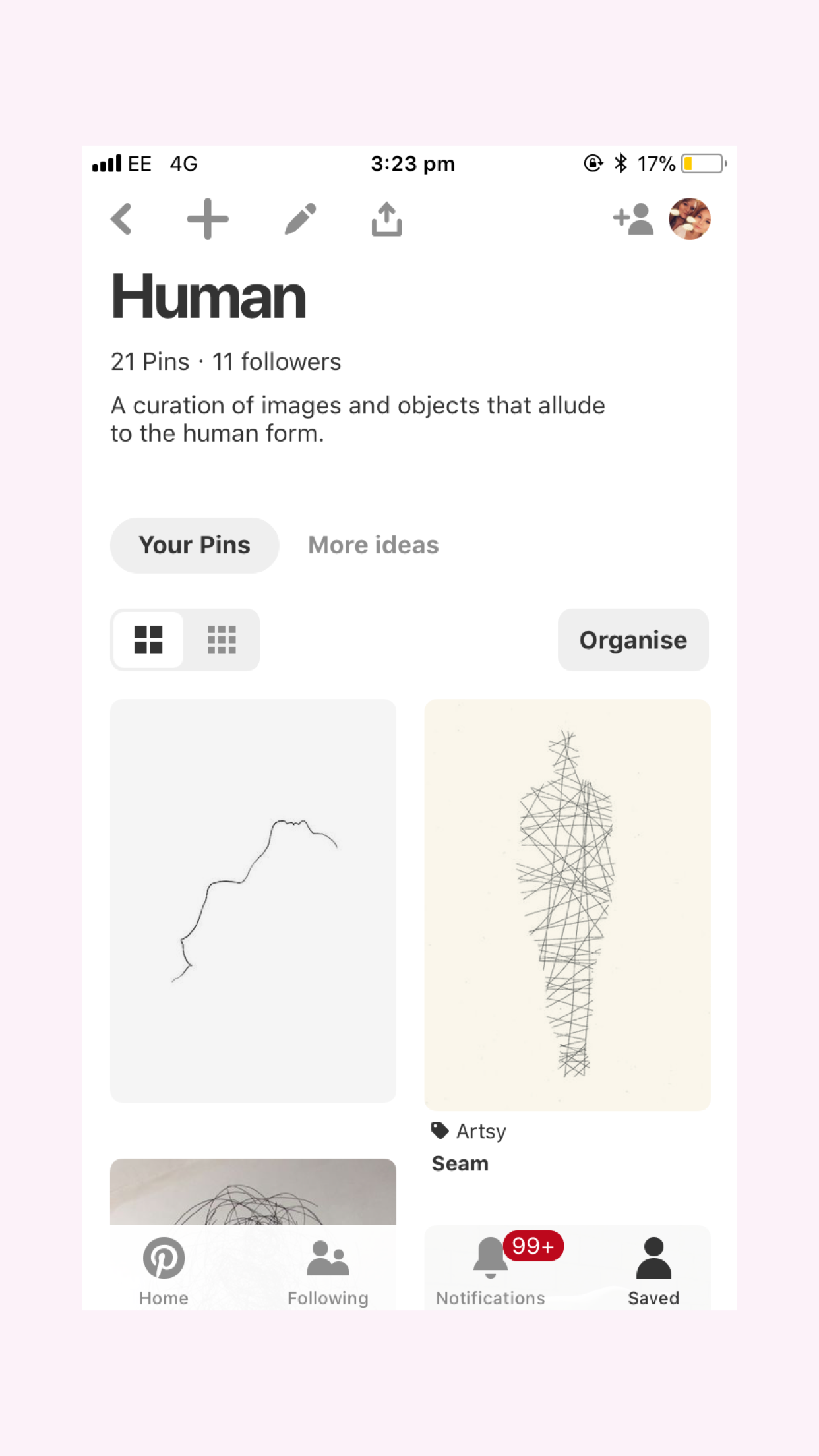
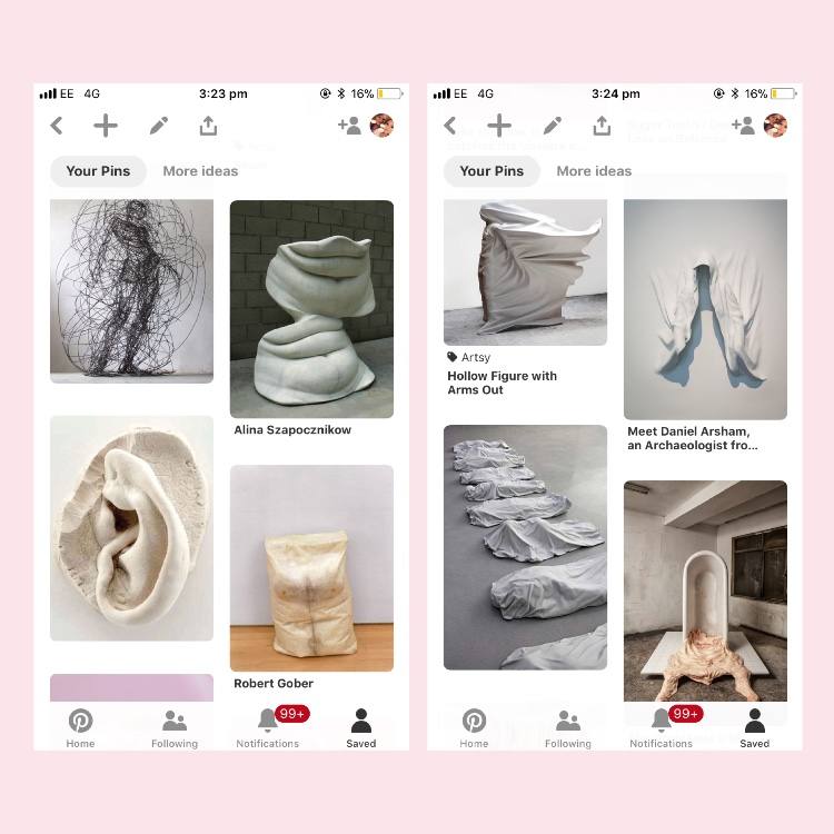
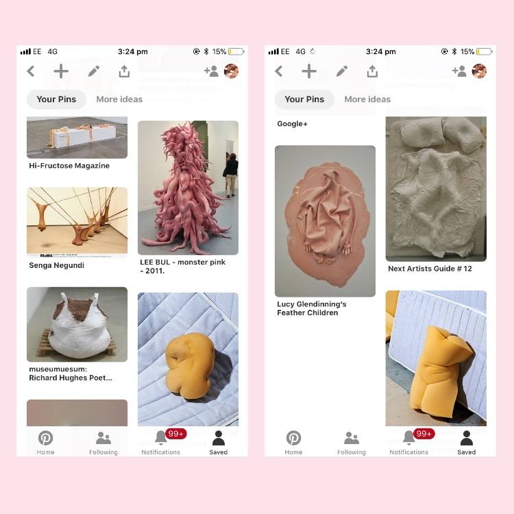
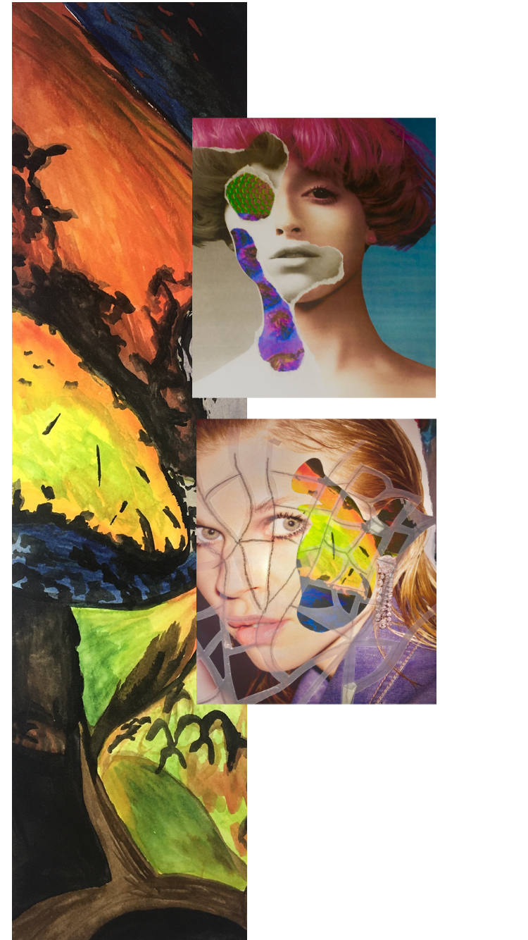
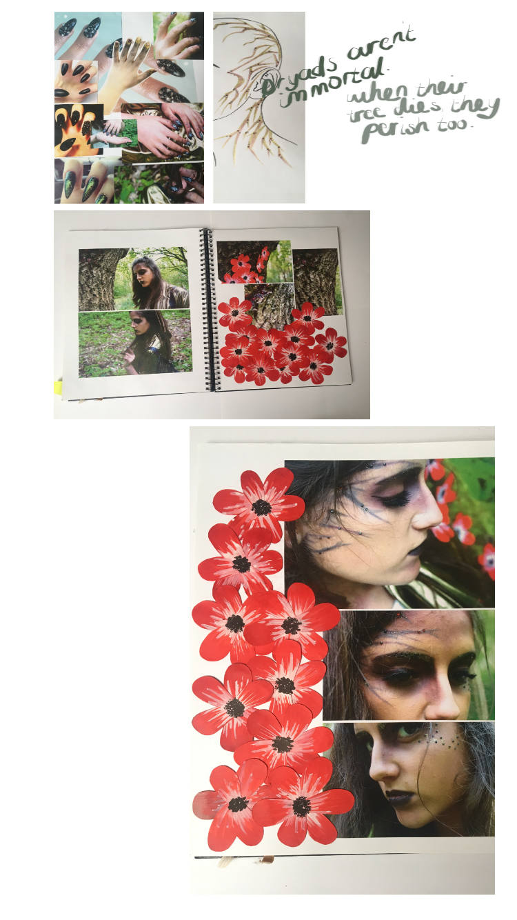
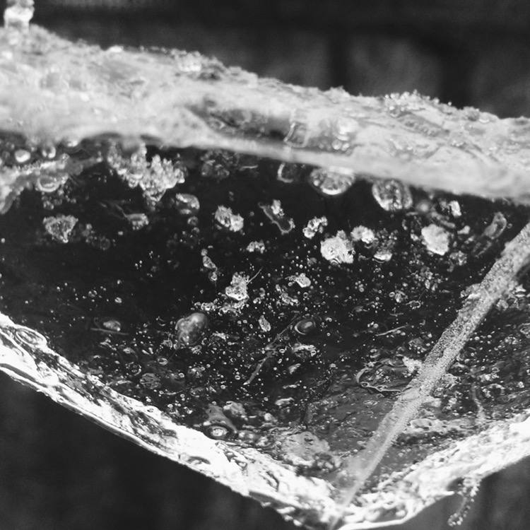
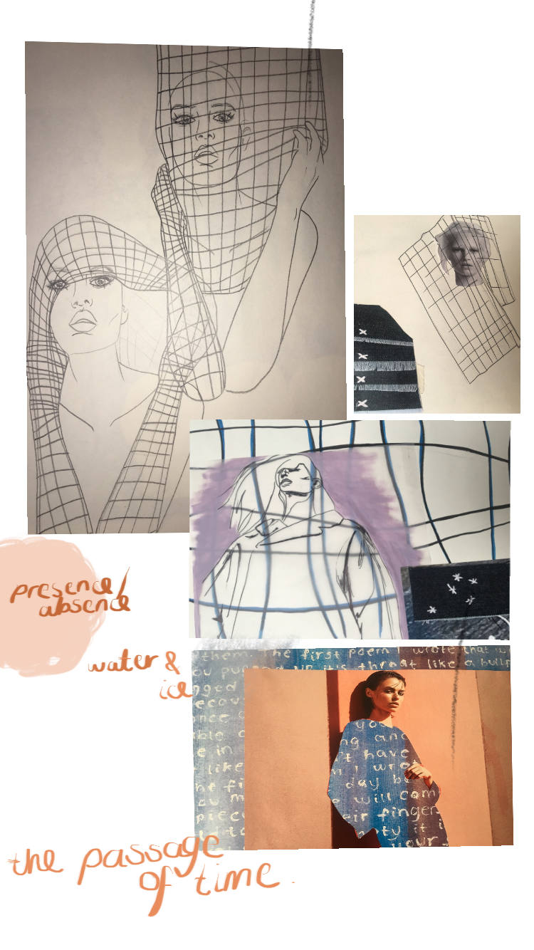
As a starting point I looked into artists and designers who have produced work aesthetically similar to the way I imagined my work to be then researched further into the things that inspired them. My work stems from water, ice and the loss of important things – I searched the internet for articles and statistics on how rapidly the glaciers are really melting and how and when this will alter the rest of the world, not just areas in close proximity to the ice caps. Books, documentaries, the internet and social sharing platforms such as Pinterest were the most useful tools I used to gain information. From my continual research throughout my project I picked out the parts most relevant and applied them to my practical work. I did a vast amount of very varied research – next project I will document my research in a more systematic way.

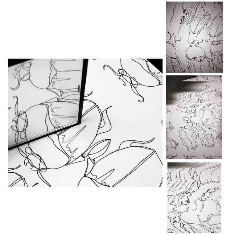
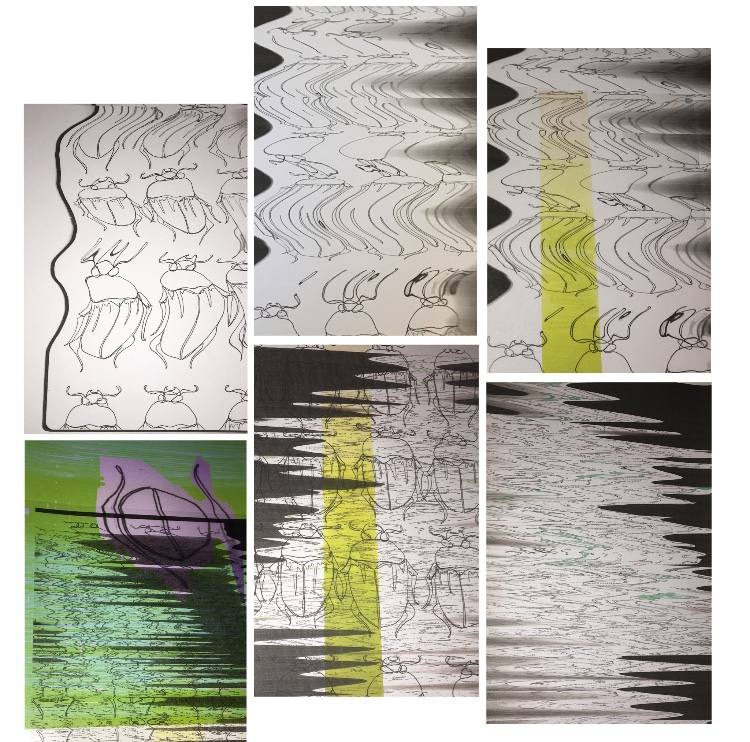
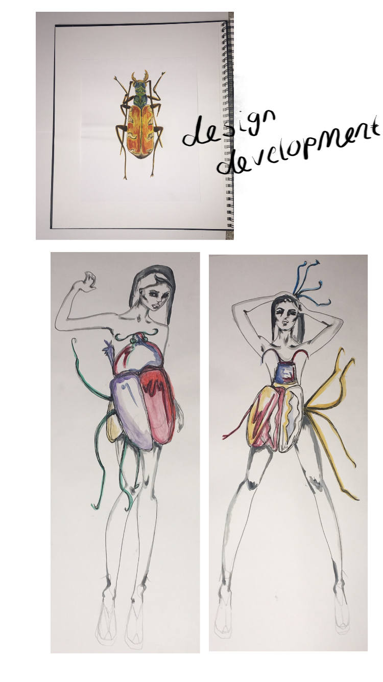
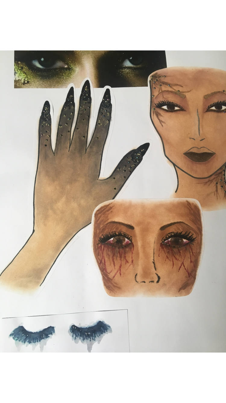
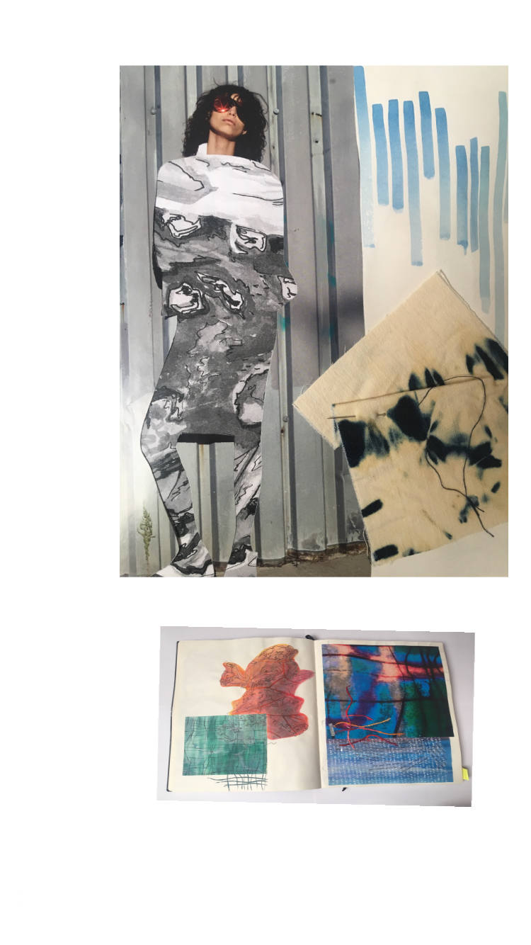
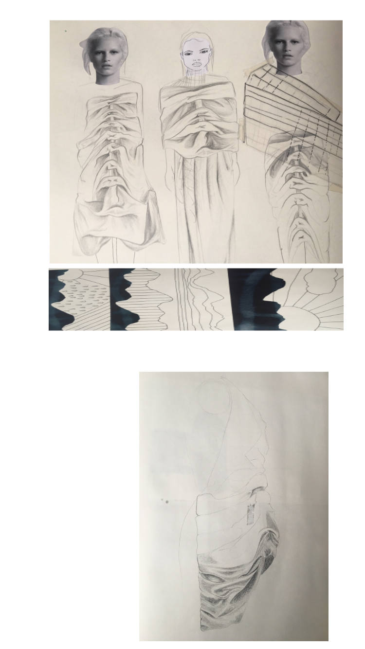
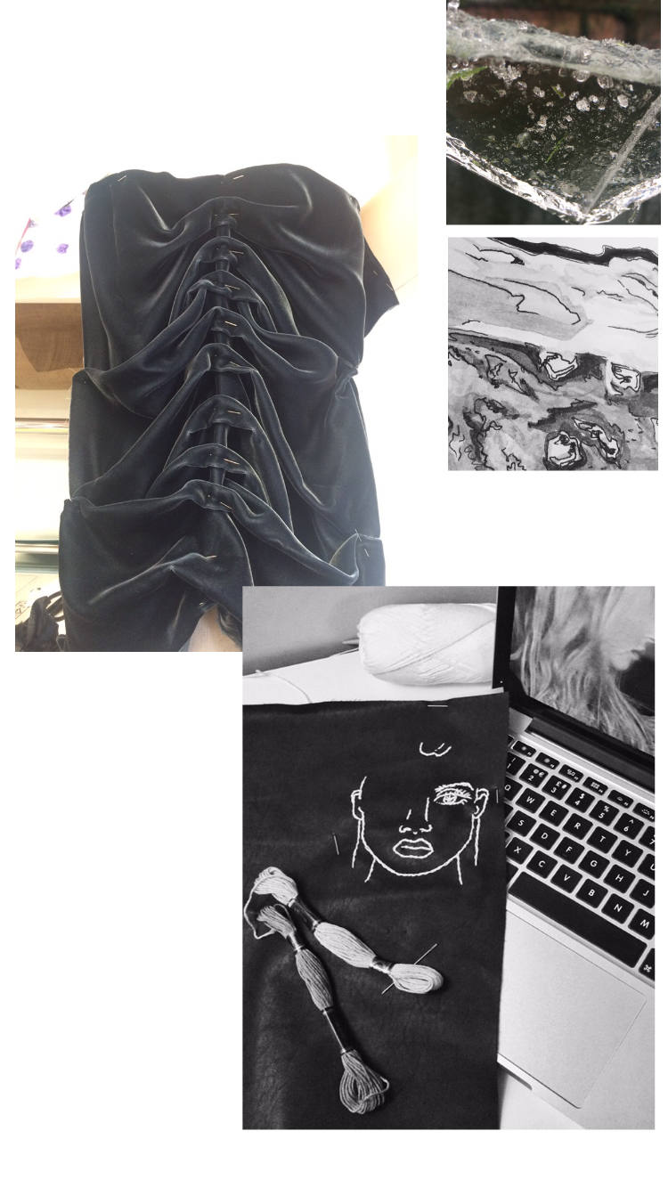
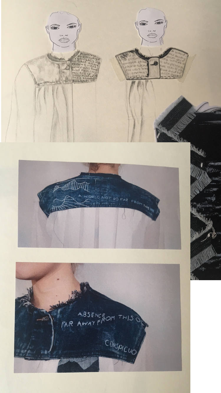
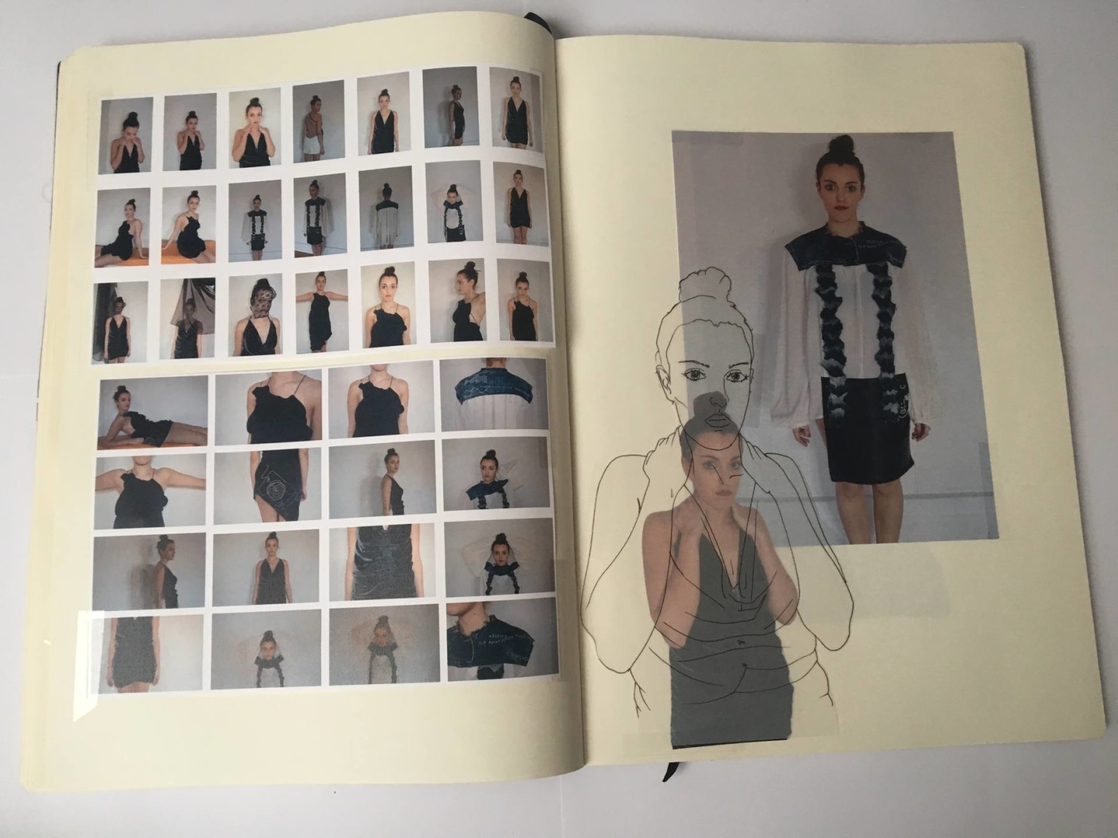
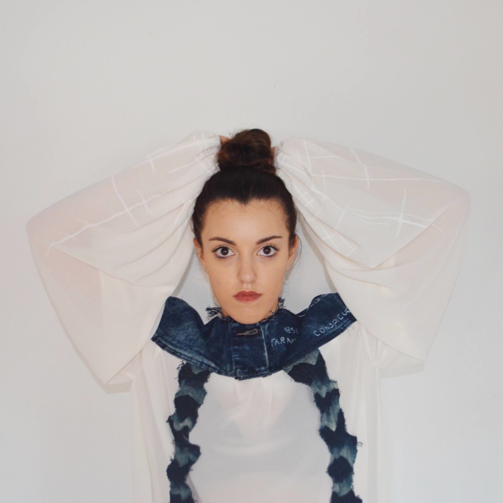
I investigated a range of materials at the start and found the fabrics I was most interested in quite quickly. The processes I experimented with include embroidery, dyeing, bleaching, pleating and physically tearing and distressing fabrics. Processes that distressed or damaged the fabric were most appropriate because it reflects the damage and distress the world is under. Through this project my understanding of how a garment is put together has greatly developed – it is the thing I have learned most about but also something I need further practice with if I wanted to be able to draft my own pattern pieces. My ideas consistently developed as my work progressed, the concepts within my theme widened with new information and I was constantly making new connections. I was using a sewing machine a lot during the project so I had to be aware of the potential dangers and the health and safety practices I needed to apply. I needed to be aware of how the machine operated before using it so no accidents occurred due to lack of knowledge. If I were to change something in regards to the development stage of my project I would have experimented with large scale fabrics earlier as opposed to spending so much time on small scale samples. This would have given me more time to drape and design on the mannequin.

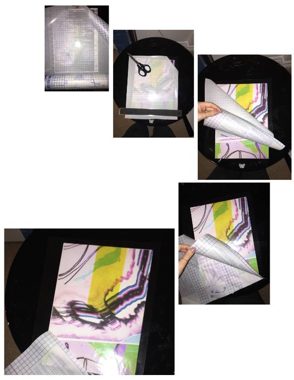
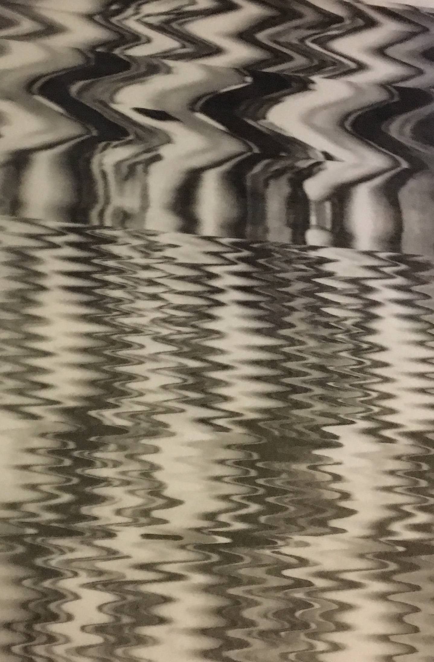
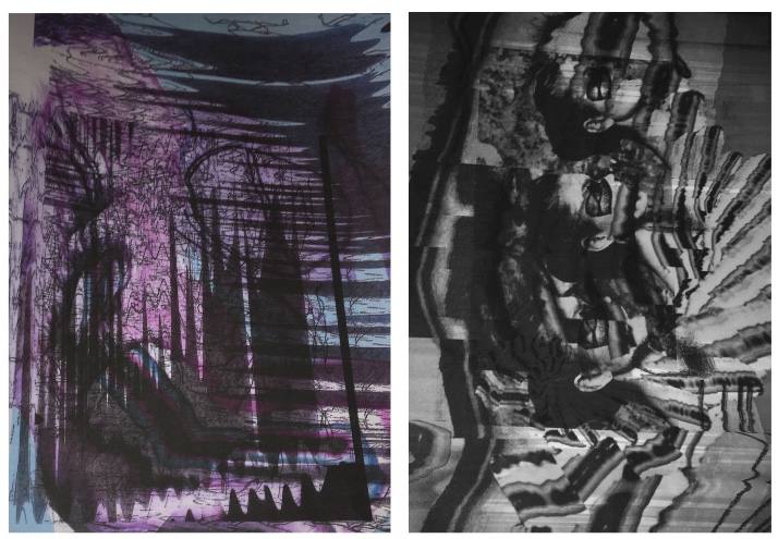
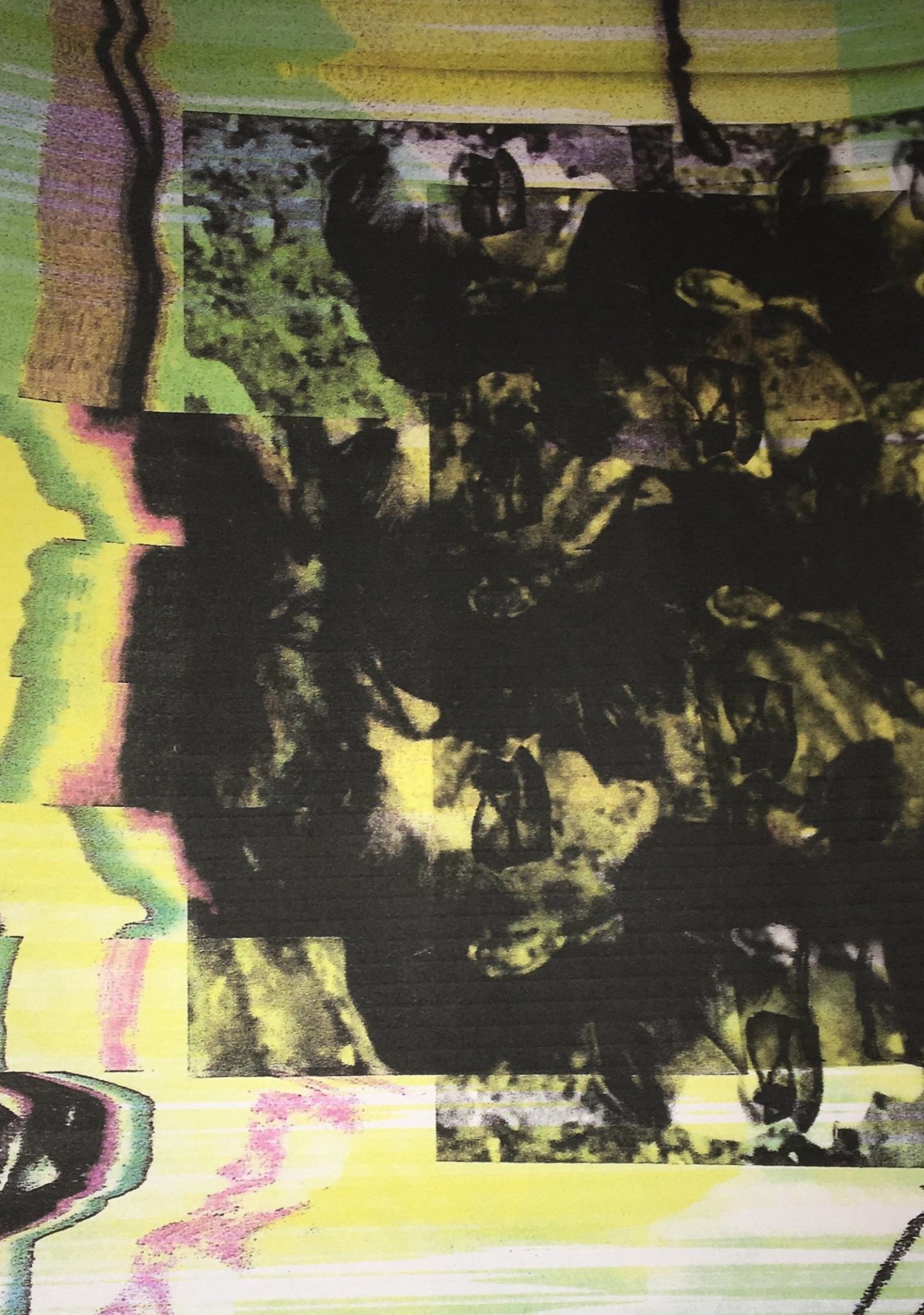
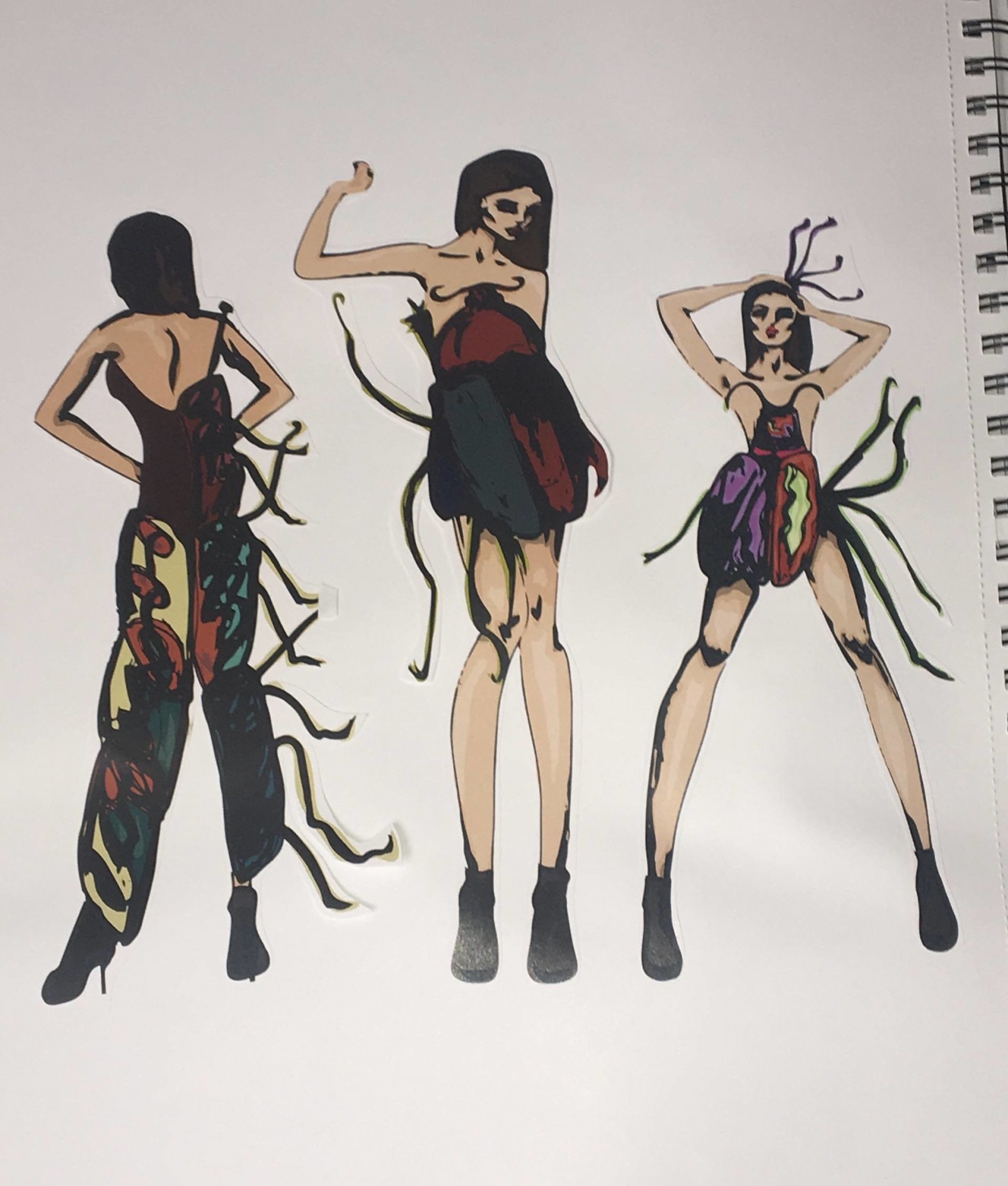
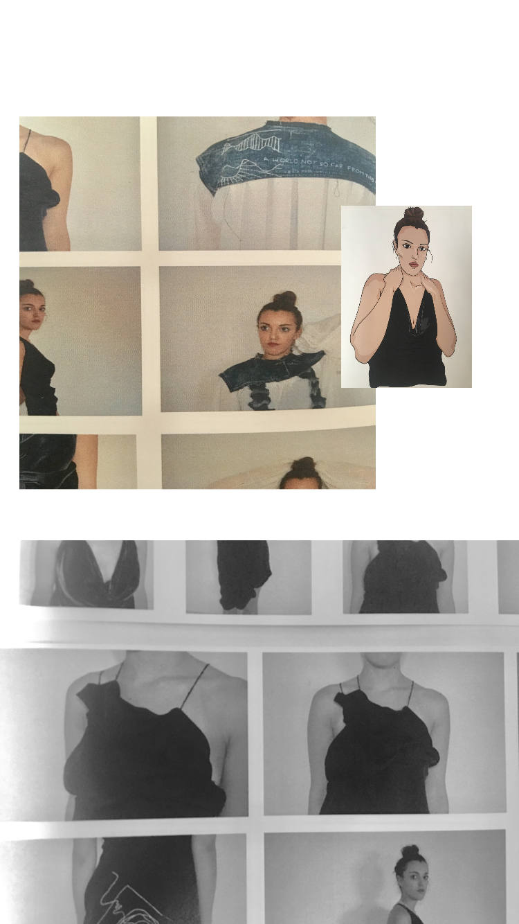
I am apply with my final outcomes. I have produced three garments made predominantly from reused materials with silhouettes inspired by the often soft movements of water and designs depicting harsh textures of icy glaciers. My outcomes are effective, I think they accurately portray the message I wanted to send and they make sense alongside the ethical beliefs of the designer and charity I’m designing for. I have met the requirements and parameters of my project however if I was to redo everything I would have made the concept of drowning and suffocation visually stronger throughout my artwork and designs. For my final exhibition I plan to get my favourite of my final photographs printed off large scale and use materials like cling film, cellophane and string to manipulate the images in a way that makes the concept of drowning and suffocation strong once more.

My technical skills have vastly improved, I am now familiar with pattern cutting and I have a real understanding of how garments are pieced together. I have been able to develop my digital and photography skills to a higher level also which has improved my ability to illustrate my designs and communicate my ideas in a clearer way. I have learned a huge amount about environmental issues and I am now aware of how normal human behaviours have big scale effects. I have gained a huge respect for brands that are sweatshop free and designers that make the effort to use environmentally sound, ethically sourced fabrics and ethical labour because I now realise how much good it could do.


Human Bug

UAL Level 3 Extended Diploma in Art and Design, 2015.

IMG_0575

IMG_0577

IMG_0571

FullSizeRender

Savage Beauty

Savage Beauty – UAL level 3 Diploma in Art and Design Final Major Project, Distinction grade. 2015IMG_0599

Attachment-1

IMG_0615

IMG_0614

IMG_0613

IMG_0612